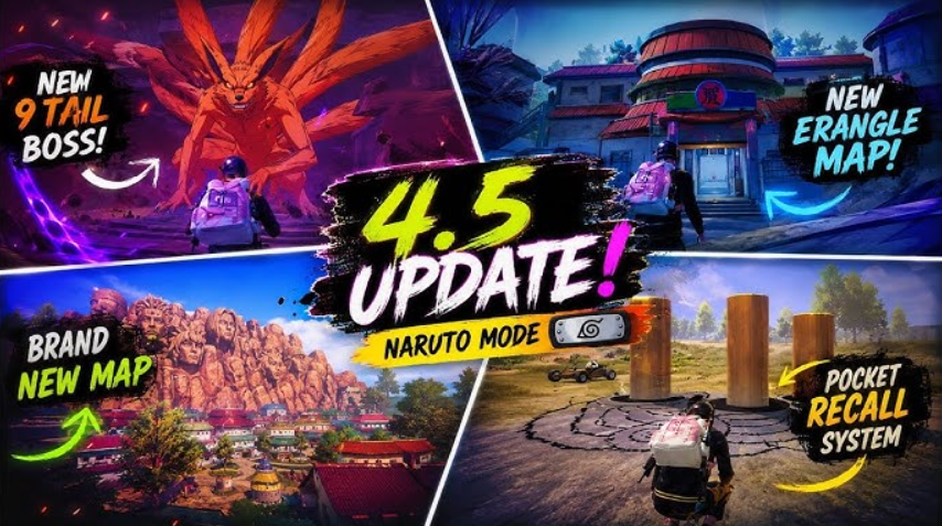
In March 2026, the developers of Kravston launched the update version 4.3 of the mobile royal battle. The main dish on the menu is a complete redesign of the visual: redesigned lobby, control panels, integration of social functions, button icons, the entire color scheme. Officially, the developers called it the “cleaner and neater UI”, promised to simplify navigation and make it easier to collect rewards. Everything was timed to coincide with the 8th anniversary with the mysticism about the “Evolving Universe” invented by him.
But what actually happened?
The community didn’t just complain, it staged a real protest. Reddit, X (Twitter), Facebook, and TikTok have been flooded with negativity under the update announcements. The statistics are eloquent: 80-95% of comments require either a rollback to the old interface, or urgently add a dark theme and a toggle option.
Table of Contents
What really annoys gamers
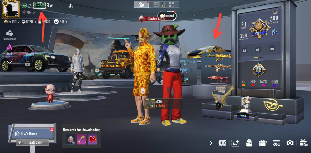
Dazzling white design
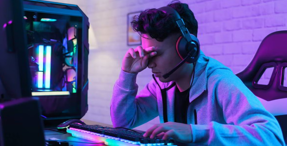
The first thing that hit my eyes was the aggressive light background. Dark mode either disappeared completely from the update, or it broke. Players complain: after a few minutes of playing, their eyes are already starting to hurt. It became a meme in the community — a search for “white UI problem” on the networks yields thousands of relevant posts.
The design looks unfinished
The fonts are strange, the buttons seem to be cut from a 2015 file, and the overall impression is like in a budget mobile phone, not in a top—end battle royale application. The discussion on Reddit is full of phrases like “cheap”, “unpolished”, “loses all its chic”. People got used to the dark, sophisticated style of the old menu — and the contrast was shocking.
It works inconveniently
The trivial ergonomics are lame: there are more clicks for simple operations, the layout of the elements is confusing, the “More” button is annoying for almost every second player, and the social lobby is functioning worse than before.
It felt like we were playing a completely different game.
For seven or eight years, the interface has been perfected, becoming more convenient, recognizable at a glance. And after the update, a complete rework, everything is unusual, you need to retrain. Besides, my eyes hurt from the whiteness.
The volume of protest over the facts
There’s a lot of discussion going on on Reddit
The r/PUBGMobile forums were flooded with posts with titles like “New lobby design is absolute trash,” petitions demanding “bring back the old UI,” and detailed critical reviews titled “Concerns About the New UI and Request to Keep the Old UI.” There are hundreds of comments under each post, calls for a rollback or at least a selection button.
There is a wave of outrage on X and Twitter
The official PUBG MOBILE account receives a flurry of negativity under every post about version 4.3. Top comments are all in the style of “the old interface was better”, “return it as it was”, “very disappointed”.
There is also a war on video platforms
YouTube and TikTok are literally packed with materials about the “White UI Problem After 4.3 Update | Dark Theme Not Available” and broadcasts like “New Update 2026 Sensitivity & UI Changes”. Most of the videos are in the criticism section, and the likes are unambiguous.
The developers have taken control of the situation
What is important: Krafton and Tencent did not ignore the rebellion. A few days after the update was launched, the team recognized what had happened.
On March 13, 2026, X officially announced:
«We have investigated the issues… such as the social lobby, some UI elements being too bright, font and button sizes, and inconvenient layout operations, and have planned urgent fixes… We sincerely apologize for the poor experience!»
Fixing began immediately. A patch has already been released that redesigned the “More” button in the lobby. The agenda includes adjusting the brightness of elements, redesigning fonts, rearranging the display of objects, and redesigning the social lobby. They promise to complete it within 1-2 weeks.
But there’s also good news — Krafton is really listening
History shows: This is not the first time that developers have changed their minds under pressure from players.
An example from a recent story
At the beginning of 2026 (season S28, also known as Season Ascension), the Promotion Matches system was introduced for top ranks — Ace and above, including Ace Dominator and Conqueror. To rise higher, it was necessary to consistently take the top places in five consecutive rounds. It depended on the map: you had to get into the top 12 or top 6.
A reaction? Explosive. The community howled that the system was stupidly impossible. The ranks are blocked, it is impossible to rise without farmbots or some kind of unimaginable luck, the gameplay is not designed for this.
And what happened? In update 4.3, the developers announced a relaxation of conditions. They want to reduce the number of matches to four (and in some situations even less), the placement thresholds are lowered so that the overall leveling process becomes “easier and smoother overall”. This is a direct response to tens of thousands of complaints from all platforms.
The same scenario unfolds with the interface: public anger → official recognition of the problem → urgent edits → long-term recycling plan.
What’s next (forecast for March 16, 2026)
A complete rollback, of course, is unlikely. But such reversals are quite possible.:
— The upcoming hotfixes will bring back the dark theme or significantly dim the brightness — this is the minimum that a lot of people require; — Or add a toggle button to switch between the new and old design. Version 4.3.x or even 4.4 may bring just that.; — If the wave does not subside, Krafton can recalculate its priorities and engage in a larger—scale redesign.
There are chances. The main condition is that the more actively the community expresses dissatisfaction, the faster the emergency response mode is activated.
How to speed up changes
If you are also in the camp of critics of the new menu:
— Write to [email protected] — the support service tracks trends; — Post on Reddit (r/PUBGMobile) — maximum visibility; — Leave comments under PUBG Mobile posts on X, Facebook, TikTok; — Create content videos, memes about the white interface and pain in the eyes help to attract attention.
The Promotion Matches rating story shows that Krafton knows how to listen. If you loudly and consistently demand the return of a convenient dark lobby (or at least give a choice), the chances of winning are real.
We hold our fists, we spam feedback, we believe in the power of the collective voice.