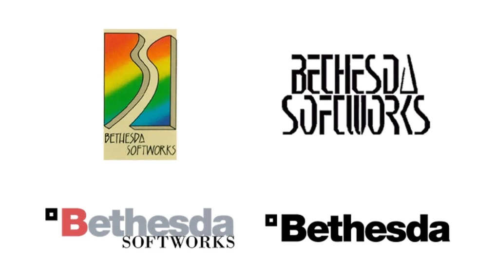
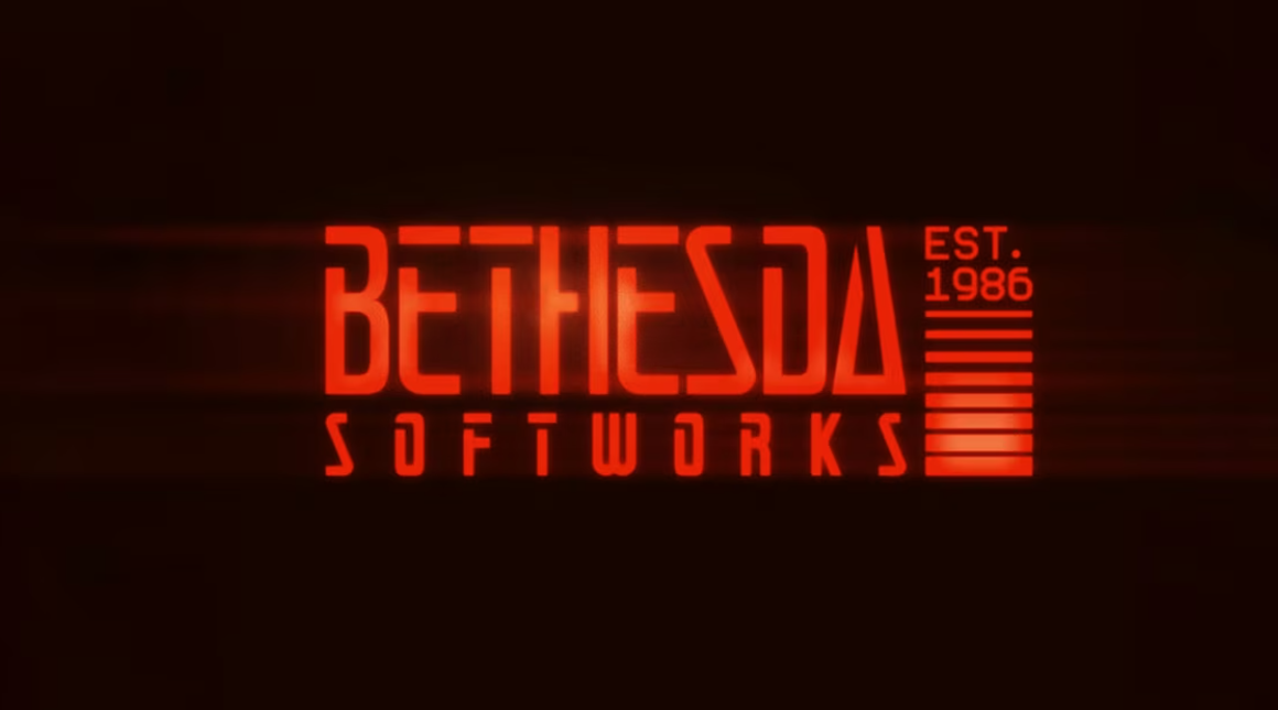
Bethesda Softworks changed its logo for the first time in 16 years—and did so with a nod to its past. On July 30, 2026, in anticipation of the company’s 40th anniversary (founded June 28, 1986), the publisher unveiled a retro design inspired by the logo from 1986–2000. The neon lighting and “EST.1986” text echo the original, while modern trends include barcode elements and a cyberpunk font that pays homage to the founding era.
The old logo—a black “BETHESDA” lettering with a square—had been in use since 2010. The new logo is colorful, features “Softworks” as part of the logo, and features a glowing red-orange glow. It’s important to note that Bethesda Softworks (the publisher) and Bethesda Game Studios (the developer) are separate divisions. The developer studio’s gear logo hasn’t changed for 25 years, and the publisher’s is currently using it. It hasn’t been officially confirmed whether this design will be permanent or just a temporary anniversary gesture. But it’s already popping up on social media.
Fans have reacted to the news with mixed reactions. On the one hand, they’re praising the style, the nostalgia, and all that. On the other, the question keeps popping up in the comments: “Where’s The Elder Scrolls VI?” Incidentally, the logo has already been featured during anniversary sales on Steam and the Epic Games Store, and will appear in future releases of Fallout 3 Remastered, Fallout New Vegas Remastered, and The Elder Scrolls VI. There are no release dates yet, but the mere fact of the visual change goes beyond a simple rebranding: it’s a sign of a new chapter. Or, at the very least, a new avatar.